


Before charts became the norm, traders only looked at the ‘tape’ or raw price movements to analyse the markets. This is called ‘reading the tape’.
But with the advent of charts, most traders utilise them for an easy and graphical interpretation of market movements. Charts can also show patterns, trends and other visual signals that can help traders identify trading opportunities.
In this article, we’ll discuss the three most commonly used forex chart types used by technical analysts and traders, while also highlighting some of their advantages and disadvantages. By the end of this article, you will know how to read forex charts and be able to identify which chart types work (or don’t work) for you.
Before that, let’s deep dive into exactly what the different types of trading charts are.
What is a price chart?
A price chart is a visual representation of a particular instrument’s price over a set period of time – this could be a currency pair in forex trading, stock indices, precious metals or any other financial assets.
Price charts are one of the most important tools for beginner traders to learn. They must understand how they work in order to conduct a technical analysis of the market they are looking to trade in. The chart visualises a set period of time where trading activity is happening on the asset – anywhere between one minute to a day or a full week.
The charts have an x-axis (horizontal axis) representing the time scale, while the y-axis (vertical axis) represents the price scale. By incorporating technical indicators and analysing the chart from left to right (where the most recent price change is shown on the right side of the chart) traders can identify patterns and make an assessment on the probability that the asset will increase or decrease.
What is a forex chart?
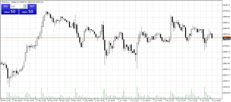
A forex chart shows the changing price of selected currency pairs over time. Exactly like other price charts, the x-axis shows the time while the y-axis represents the price.
The below image is an example of a forex chart using the EUD/USD currency pair.

How do chart timeframes work?
The chart timeframe can be selected to showcase the trading data on the financial instrument you are analysing – for example a specific currency pair.
The trading platform you are using will likely have a default timeframe of one day but you can change it to reflect whatever amount of time you would like, from as low as one minute to as long as one month.
For example, if you were to change the timeframe to one hour, each point on the chart would now represent an hour’s worth of trading data, whether it be on a bar, line or candlestick chart.
How to access live price charts?
Once you understand what a price chart visually represents, you need to know where you can find this essential tool. These charts showcase buying and selling trading activity happening in the market in real-time for whatever financial instrument you want to view.
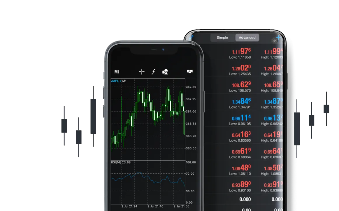
To be able to access live forex charts you will need to log in to the MetaTrader 4 trading platform. To do so, either sign up for a live trading account or a demo trading account to experience a replica trading environment showing the same data in real time.
Different types of forex trading charts
There are many different types of charts used in forex analysis and any type of technical analysis related to a financial asset. Depending on the trading style or type of analysis, one chart may serve you better than another.
The three most popular types of forex charts are:
- Line charts
- Bar charts
- Candlestick charts
Line chart

Line charts are the easiest chart type to read. They show you the close price for a given time period, typically represented by a continuous curved line that connects dots that represent the changes in price over certain intervals of time.
Line charts give a clear, simplified view of the current market situation and they work best for people who want a quick glimpse of where the market is heading. This type of chart is ideal for new traders who require simplicity and clarity, and it also teaches them basic chart reading skills which they can later develop to more advanced levels using candlestick charts.
To closely monitor their trading strategies, experienced traders usually require more information than a standalone line chart offers. Unlike the candlestick chart, which displays the daily open, close, high and low prices of the asset, the line chart only offers the closing price point, where a lot of strategies will require more data than that.
| Pros | Cons |
| SimplicityEasy to understand even for beginners | Does not show gaps An example will be the price gap between Friday’s closing price & Monday’s opening price |
| Good for graphic analysis Straightforward depiction of support and resistance levels and easy-to-determine patterns | Does not give full information In comparison to the other charts, does not show other details concerning what happens during the day |
Bar chart

Bar charts (also known as OHLC charts) are an upgraded version of the line chart, offering information on the ‘Open’, ‘High Low’ and ‘Close’ prices – hence the abbreviation.
They are typically represented by a vertical line with two horizontal lines to the left and right. The two horizontal lines depict the open price and closing price, while the top and bottom of the vertical line indicate the highest price and lowest price reached during the given time frame. Bar charts can be used to represent any period of time, ranging from as little as a few seconds to a week or more.
Due to each bar representing a period of time, different timeframes will be useful for investors with various strategies and goals. A long-term investor may find it more beneficial to use a week timeframe, while day traders will utilise a much shorter time frame like 30 seconds, one minute or five minutes.

| Pros | Cons |
| ComprehensiveGives an excellent view of the Open, High, Low, and Close of the price | Range dominates visualsThe open/close level of each bar is harder to notice when the chart is full of bars |
| Provides insights into trends and patternsAble to observe the contraction and expansion of price ranges during trends, over a given range of time |
Candlestick chart
The candlestick chart is one of the most popular chart types used by traders. The origin of candlestick charts (sometimes referred to as Japanese candlesticks) dates back to 18th-century Japanese rice traders, who came up with this chart for the purpose of analysing the rice markets.
Candlesticks are made up of two separate parts known as the body and the shadows. The top and bottom of the body tell us the opening and closing prices during the given time period. The top and bottom of the shadows tell us the highest and lowest prices reached during the given time period.

The top and bottom of the candlestick body reflect the opening and closing prices in the given time period.
Typically, if the closing price is lower than the opening price, the candle body will be red or black. If the closing price is higher than the opening price, the body will be green or white.
In this case, black candlesticks tell us that the price is declining, while white candlesticks tell us that the price is increasing.
While red and green or black and white are the most common colours to depict price movements up and down, these colours can be easily customised.
| Pros | Cons |
| ComprehensiveSimilar to bar charts, it gives an excellent view of the Open, High, Low, and Close of the price | OverwhelmingMight seem like an information overload to a beginner trader |
| Able to identify trends and connect psychology with the price patternThere is a full reference below of 1 bar to 4 par battens which helps traders make judgements on the future direction of price |
Mountain chart
A mountain chart is very similar to a line chart, where it still follows the close price but underneath the line, the area is shaded (the shadow of the line gives the appearance of a mountain.
What is the best chart for forex?
The most commonly used forex chart is the candlestick chart. Every trader has their own preference but candlestick analysis can provide a clear read on the current sentiment of the market.
Why are candlesticks so useful?
Compared to line and bar charts, candlesticks capture the most information and depict the broadest picture of price changes over a fixed time frame.
You can tell the emotions behind price movements e.g. long “wicks” can reveal strong support and resistance levels if observed on longer periods and can show violent movements within a single day.
What are support and resistance levels?
Support and resistance levels are areas where the price of a currency pair is likely to reverse or stage a breakout.
A support level is a level where the downward price trend of a currency pair pauses as buying demand increases, so the trend reverses and turns upward. The same reasoning applies to resistance levels where the upward price momentum of a currency pair weakens and the price is likely to reverse and head downward. Support and resistance levels can provide excellent opportunities for traders to open new trades.

What are the benefits of using charts?
Familiarising yourself with different chart types can enhance your trading as they deliver many benefits, including:
- Visual illustration of price movement can help identify important trends and patterns.
- Helping you spot entry and exit levels that may not be obvious without a chart.
- Market sentiment and trader psychology – represented in extreme price movements –are captured in chart patterns.
- The ability to be used in conjunction with fundamental analysis to confirm trade entry and exit levels.
- Use of historical data to provide a perspective of price movement over different time frames.
What are the main forex timeframes for charts?
Many different timeframes are used by traders depending on their forex trading strategy, though in the forex market timeframes can be split into three common options: long-term, medium-term and short-term. It’s up to the trader to pick the best timeframe for what they are trying to achieve.
Some traders like to utilise a technique called multiple time frame analysis: rather than selecting just one timeframe, they will view the currency pair under different time frames. Generally, the trader will use a longer timeframe to identify a longer-term trend, while a shorter timeframe is used to find a better entry into the instrument.
Refer to the table below to see the different trading styles and how they match up with the best-suited timeframes on forex trading charts.
| Chart | Day Trading | Swing Trading | Position Trading |
| Trend Chart | 30m – 4h | Daily | Weekly |
| Trigger Chart | 5m – 60m | 2h – 4h | Daily |
Now that we’ve explored the three main types of charting, you should be able to identify which ones suit your type of analysis the best.
While they all serve the same function – i.e. to indicate where a price has been and currently is – there

